Why In Our Time Economics Episodes Inspire Great Merch
In Our Time has run on BBC Radio 4 for nearly three decades, and in 2026 its economics episodes remain a favorite for new and longtime listeners. These aren't lectures. They're conversations among historians, economists, and philosophers, guided by Melvyn Bragg's relentlessly probing questions. The show treats economics like a series of big ideas - ideas with faces, feuds, and catchphrases. That gives merch designers an enormous pool of visual material.
Think about the classic episodes: Adam Smith and the invisible hand, Marx's critique of capitalism, Keynes versus Hayek on government spending, or the stagflation debate of the 1970s. Each one maps cleanly onto a t-shirt design - a portrait, a quote, a graph, a one-line reframing.
Three economics episodes that make perfect shirt material:
- Adam Smith's Wealth of Nations - the invisible hand works as a subtle graphic.
- The Keynes vs Hayek debate - two names, two colors, one design.
- Karl Marx and Capital - a bold portrait with a sharp quote.
From a design perspective, economics is unusually visual. Supply and demand curves have a clean geometry. The Phillips curve is a recognizable swoop. Even the language gives you hooks: 'creative destruction', 'comparative advantage', 'liquidity trap'. I've found that designs using a single idea and a single line of text tend to sell best. They read from across a room.
Why Economics Is Such a Visual Subject
The reason economics translates so well to apparel is that its core ideas already have shapes. A supply and demand graph needs no label. The Laffer curve is a single squiggle. The production possibilities frontier is a clean arc. All of that can be printed small and still feel smart.
What Makes an Economics Design Work
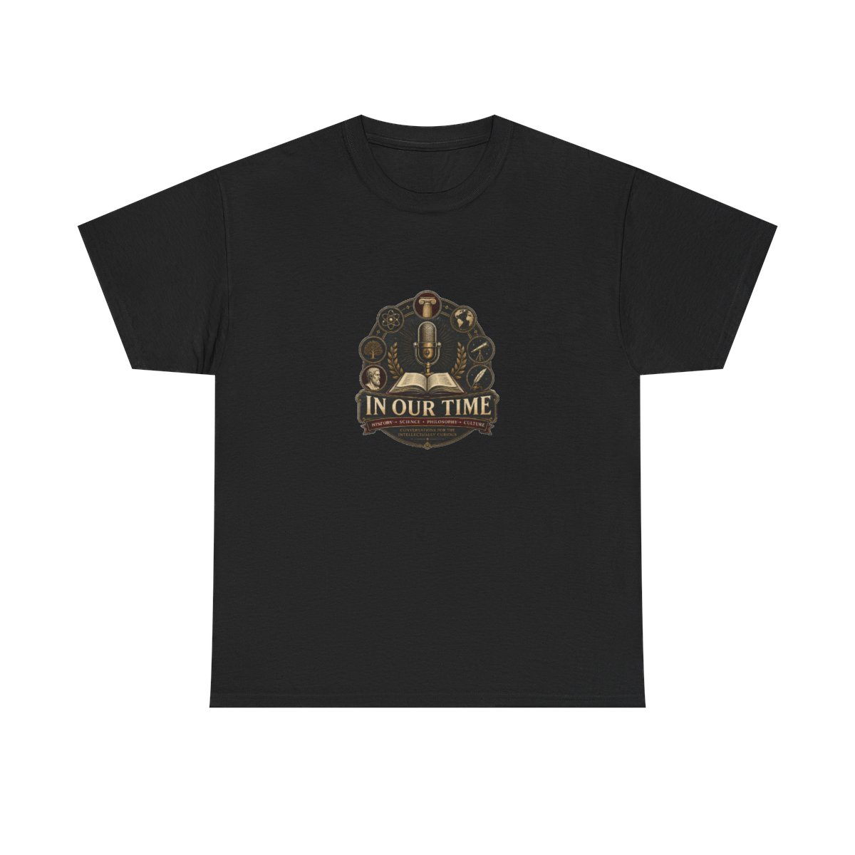
My test for any intellectual merch is the distance test: can you tell what the shirt means from six feet away? If the design needs a paragraph of explanation, it fails. The In Our Time-inspired designs that keep selling use oversized typography, clean line art, and a hint of wit. A shirt that simply reads 'Invisible Hand' in a serif font does more work than a cluttered chart.
Print quality matters too. Direct-to-garment printing on heavyweight cotton keeps fine lines sharp. That's why the better shops use 240 GSM cotton rather than thin budget blanks.